# PIE CHART
l Pie Chart 는 왜 필요한가 ?
데이터를 각자 구별되는 그룹이나 범주에 포함시켜 각 조각의 크기가 다른
그룹에 비해서 상대적으로 얼마나 큰지 나타낼 때, 즉 비율을 보여 줄 때 사용
예 :
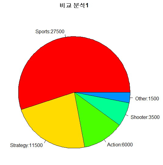
> (x <- data.frame(Genre=c('Sports','Strategy','Action','Shooter','Other'),
Units.sold=c(27500,11500,6000,3500,1500)))
Genre Units.sold
1 Sports 27500 <- 도수 (frequency) : 항목의 수 (Count)
2 Strategy 11500
3 Action 6000
4 Shooter 3500
5 Other 1500
- 양쪽 괄호면 결과값이 바로 나옴
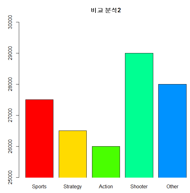
> (y <- data.frame(Genre=c('Sports','Strategy','Action','Shooter','Other'),
Units.sold=c(27500,26500,26000,29000,28000)))
Genre Units.sold
1 Sports 27500
2 Strategy 26500
3 Action 26000
4 Shooter 29000
5 Other 28000
> pie(x$Units.sold,labels=paste(x$Genre,x$Units.sold,sep=":"),col=rainbow(7),
main="비교 분석1")
> pie(y$Units.sold,labels=paste(y$Genre,y$Units.sold,sep=":"),col=rainbow(7),
main="비교 분석2")

>> y 그래프틑 각 장르별 판매된 게임의 비율을 비교할 때 파이 차트는 적절하지 않기 떄문에 bar plot이 필요하다
- bar plot은 범주들의 값이 비슷한 값을 가질 때 정밀한 비교를 하기 위해 유용
> barplot(x$Units.sold,names.arg=x$Genre,col=rainbow(7),main="비교 분석1")
> barplot(y$Units.sold,names.arg=y$Genre,col=rainbow(7),
main="비교 분석2",ylim=c(25000,30000),xpd=F)
'빅데이터과정 > R' 카테고리의 다른 글
| #50_140825_R_이상치, 중앙값, 상한, 하한 (0) | 2014.08.26 |
|---|---|
| #50_140825_R_TWITTER 분석 (0) | 2014.08.26 |
| #50_140825_R_움직이는 GRAPH (0) | 2014.08.25 |
| #50_140825_R_AUDIO GRAPH (0) | 2014.08.25 |
| #49_140822_R_LINE CHART (0) | 2014.08.22 |